Improve Your Shopify Site’s User Experience (UX) with Returns Data

Shopify Returns Management Best Practices to Improve User Experience
By Ross Beyeler, Partner and COO of Trellis
It doesn’t matter how much you’ve put into perfecting your product, returns are a fact of life for ecommerce brands.
Even if your customer loves your products, chances are they will need to return something at some point. Maybe it doesn’t fit quite how they expected. Maybe the color they thought would match perfectly with that skirt they already have in their closet actually clashes horribly. Or maybe there was a manufacturing defect, or a shipping delay that meant it arrived too late for the event they wanted it for. Or a zillion other reasons.The key to minimizing your returns is there, though, in all of those reasons. If you can figure out the why behind your returns, you can make changes to prevent them in the first place.
Now, returns may need to be addressed in product design and manufacturing, or customer service, or distribution… but here I’m going to talk about one of the easiest ways to dramatically cut down on your returns and improve your user experience: making changes to your site itself.
Returns Are Your Fault (Most of the Time)
It’s true. Returns are the merchant’s fault nearly every time. Before you start to feel defensive, which I totally get, let me explain. Yes, there are definitely the shoppers out there who buy a shirt in three different colors and bracket the sizing on both sides just so they can try them all on and find the perfect one and return the rest. Not to mention the customers who order ten items, keep their favorite three, and return the rest. And the others who order something to wear it once to an event, and then return it (*shudder*). Those customers deserve the ire of every online brand, but those customers really aren’t the majority.
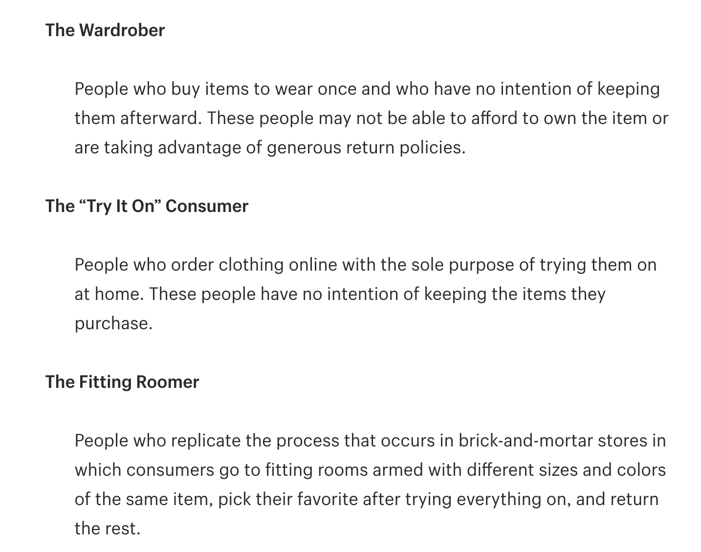
Shopify: Ecommerce Returns: Policy, Rates, Best Practices & Statistics (2018 Holiday Ed.)
Most people just want to order something, have it arrive on time, looking like they thought it would look, fitting like they had imagined it would fit, so they can happily keep it.
When that simple process doesn’t work, it’s on you.
What could be causing the disconnect between what your customer expects and what your product really is? It could be:
- Poor product photography that displays inaccurate colors, doesn’t show key details, or just doesn’t show the product from enough angles or perspectives
- Minimal product description that doesn’t set realistic expectations for fit, feel, transparency, texture, or any other information that someone would miss by not being able to pick up your product and hold it in their hands
- Realistic timelines for delivery and access to shipping updates
- Lack of education about how the product would be best used and enjoyed, and how to make the most of it
Depending on the type of product and how complex it is, there may be a lot of additional types of information that you should provide.
The good news is that it’s almost always a relatively simple fix. But before you can fix it, you need to get to the bottom of what’s wrong in the first place.
Find Out Why They’re Returning
You can’t fix it if you don’t know what’s wrong in the first place. If you try without having the right data, it’s just a shot in the dark (and likely a waste of time and money).
So how can you find out what you need to know about why your products are being returned? There are three primary ways to get the answers you need:
- Ask customers during the return process why they’re returning. This can take many different forms – from a simple return code to a more open-ended request for feedback, or call-in customer support data. A tool like ReturnLogic can make collecting online returns data a breeze.
- Offer opportunities for product reviews and encourage your customers to submit their feedback.
- Collect return data from customer support.
The first option is easier to tie data directly to specific returns. But it can be a sensitive exchange – your customer is already disappointed. You want to make the return as easy as possible so your customer is more inclined to try shopping you again. So this takes some understanding of your customers, and some trial and error with how much information you can expect them to provide.
Once you have some returns data to work with, break it down into groups to help you better understand the issues. These groups may include reason codes, product category, product SKU, manufacturer, product attributes, etc.
Some of the most common reasons for ecommerce returns include:
- Product Sizing/Fit Issues
- Product Expectations
- Questions/Uncertainty During Purchase Process
- Arrived Too Late/Delivery or Fulfillment Issues
- Quality/Defects
Take a deep dive into your common return categories, and identify some of the groups that are having the biggest impact on your business (either the greatest quantity of returns or the highest value of returns, or identify the “low hanging fruit” of returns that have an easy-to-fix solution).
Use Feedback to Improve Your UX
You’ve identified some of the specific problems that are causing your customers to return. Some issues have complicated causes: maybe your product designs are consistently cut smaller than your customers expect, or one of your primary manufacturers suffers quality problems. Those problems are worth digging in to and resolving, but they’re going to take some time.
Today, we’re looking at the quick fixes. Changes you can make (relatively) easily within your Shopify backend to reduce your rate of returns.
For most of the common reasons for ecommerce returns, there’s a whole arsenal of simple improvements you can make that will improve your UX and bring that return rate down.
Product Sizing and Fit
Mostly for apparel products, one of the biggest challenges in ecommerce is how buyers and brands can best approximate the experience of taking an item into a changing room and trying it on. It’s a complex challenge, but one that a whole host of tools are helping to solve.
Describe the Fit
Does this product tend to run tight? Is it tailored to emphasize the waist? Is it intended to be styled baggy, or layered? Get your marketing team together with the product designers and make sure that your product descriptions do justice to your designs.
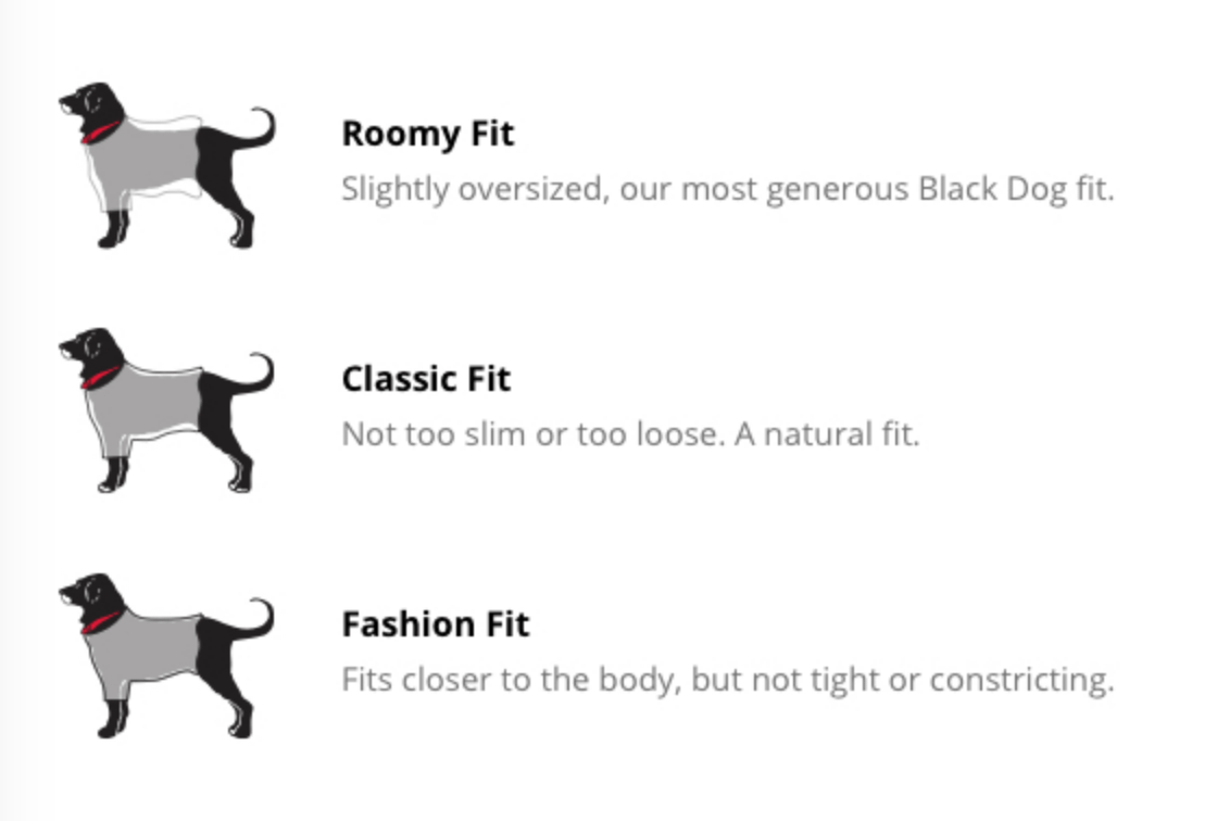
Source: The Black Dog
When customers understand how a product is supposed to fit, they can make their own decisions about whether they want to go with your styling suggestions and buy true to size, or size up or down to make adjustments for how the envision wearing the item.
Give Dimensions
The most basic start is to provide detailed dimensions and fit charts, like the below example from retailer NOBULL. Whether the information you provide is the specific dimensions for each product or a sizing chart grouped by product categories, this is critical information.
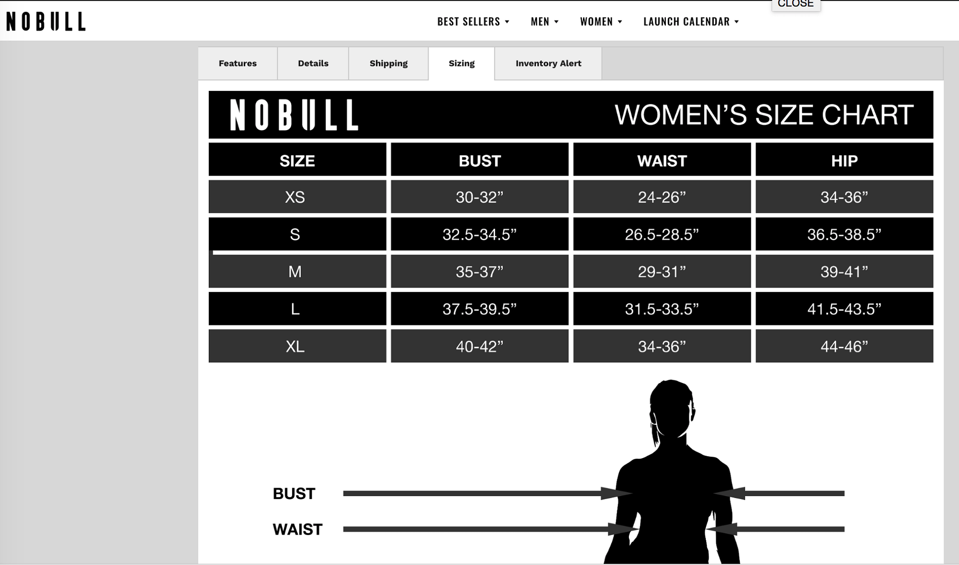
If you already provide sizing charts, examine whether there are opportunities to make this information more robust. Expand a gender-based sizing chart to include specific product categories (dimensions for skirts vs. pants and blouses vs. activewear). Or take it a step further and identify the specific products that are most often returned for fit issues, and provide fit details that are specific to that individual style.
The downside is that not everyone knows their own dimensions, or takes the time to measure their body or their favorite clothes before they make a purchase. So it’s best to combine sizing charts with other ways to assess fit.
Include Reviews
There’s only so much information you can offer in a product description. But many customers are willing to include fit information in their product reviews.

Large retailers like Amazon and Old Navy, where the above review was given, collect fit reviews from customers that include their height and weight. This hyper-specific data helps other customers understand the fit.
Show the Fit
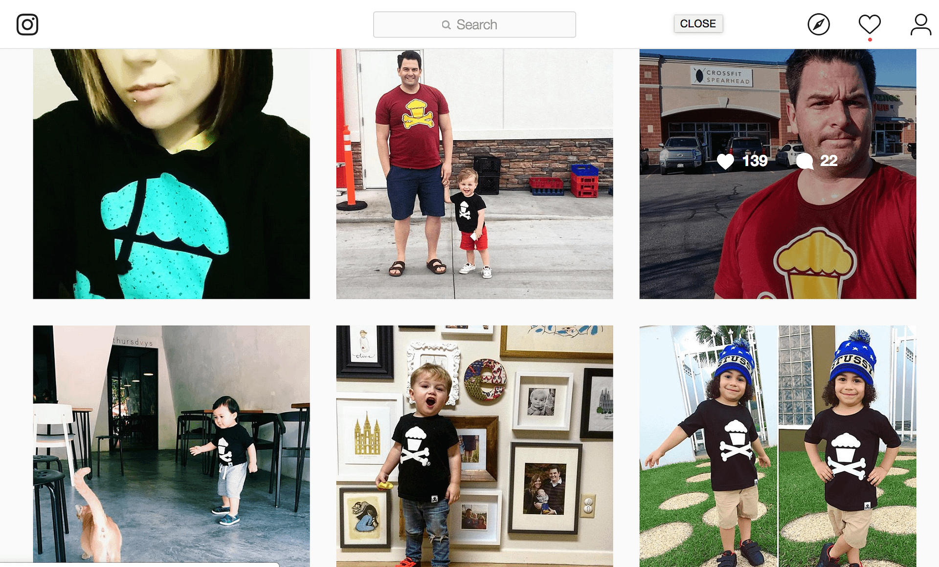
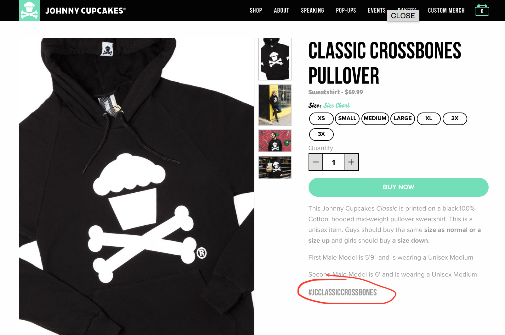
Your photography can’t show how your product will look on every body type. But your customers are already solving this problem for you. Make use of your user generated content on social platforms like Instagram to show how influencers and other customers are enjoying and making the most of your product – like apparel brand Johnny Cupcakes.
Product Appearance
Remember this dress? The entire internet debated whether the dress was black and blue or white and gold. How could that many people be that confused by color?

It happens. And it’s probably causing at least some of your returns. People sometimes see what they want to see (or simply get a wrong first impression) if the information in front of them is vague or unclear.
And even though a photograph is worth a thousand words, it doesn’t mean you don’t also need words. (And make sure those photographs are high quality, and telling the right story.)
High-Quality Photography
There is a world of difference between a quick product shot with a mobile phone, and a high-quality image with appropriate lighting and a strategy behind the visual story. When taking product photos, first think thought what story you want to tell:
- What is the style story?
- What details are important and worth showing off?
- What need does this product fill, and how does it fill it?
- What are people going to love about this product, and how can we best show that off?
- Are we showing all the important angles? Front, back, sides, bottom, inside…?
- Can we use photography to illustrate texture or feel?
Including multiple photographs, like this dress from Mahi Gold, can help tell different aspects of the story, and together with a thoughtful product description and sizing charts can answer questions about color, drape, styling, texture, and more.
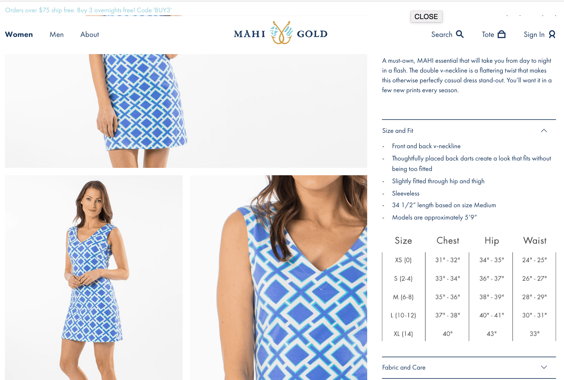
You could also consider creating a 360-degree view for products like footwear that would benefit from an all-around view.
Detailed Product Descriptions
Many product descriptions are brief and to-the-point. But there is a huge opportunity here to describe aspects of your product that can’t be easily seen in photography.
- How does it feel?
- How heavy is it?
- Is it durable?
- Is it warm or cool?
- Does it stretch?
- Is it easy to use?
- Can you see through it?
These questions will vary based on the type of product you’re selling, but whether you’re offering a dress or a motorcycle or a glass beer mug, there is important information that your shoppers need to know. It’s your job to tell them.
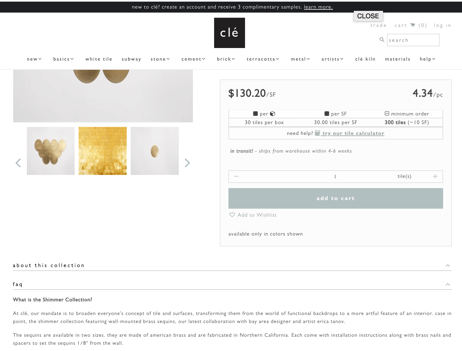
For more complex products, it may be worth introducing tabs to the product description. This will allow you to give a brief overall introduction in the default tab, with the option for more details in a secondary tab. Some products may also warrant their own FAQ within the product description, like this wall-mounted brass sequin from wall-tile brand clé.
Product Uncertainty and Questions
If your customer has a question about a product while shopping, they should have a way to get in touch with you to get an answer – before they buy.
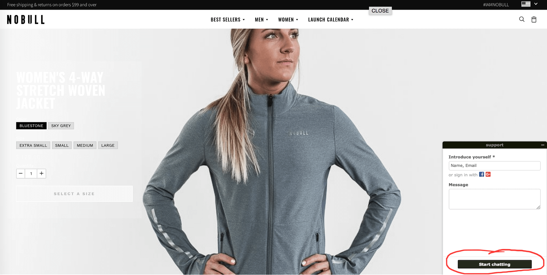
On-site text chat or mobile messaging are ideal for this, and can help direct a customer to the right product or size and prevent potential future returns.
Delivery Disappointments
You could be doing everything else right, but if a product doesn’t arrive when it was promised, that could be reason enough for a return. Consider the shopper who orders a dress for an upcoming party, but the package arrives after the event is over. Or the can of paint that gets delayed and is delivered long after the project has been completed.
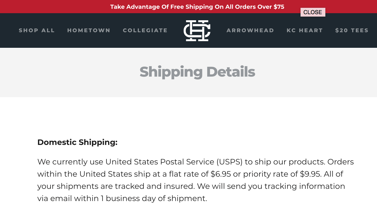
Source: Charlie Hustle
To make sure that fulfillment and delivery timing isn’t fueling your returns rate, be as transparent as possible with the timeline for delivery. This can include:
- Listing general delivery timelines in the FAQ, Shopping, or Product Pages (or all three!)
- Providing email notifications when the order has been shipped
- Providing tracking information so the customer can keep track of any unexpected delays or changes to the anticipated delivery date
By putting shipping information into your customers’ hands and being fully transparent, you’ll reduce disappointment that is out of your hands.
Encourage the Option to Exchange
Returns aren’t always the only option. But if a merchant limits their customers options to returns only, then that’s what they’ll do. The changes that they will go through with processing the return, and then go back to your site and reorder the product but in a different size, color, or take a chance on getting one that isn’t damaged this time is slim-to-none.
If the fit was wrong, a different size is all that’s needed. Or if the item was damaged, it just needs to be replaced.
Make sure that your returns process includes an option and support for exchanges first – whether it’s a self-service returns portal like ReturnLogic or a call-based customer service team. Then only if an exchange isn’t the right solution, continue with processing a return.
Returns are a complex and invasive beast. Trying to improve your returns rate can require coming at issues from many angles. One of the best (and easiest) places to start is by making relatively minor adjustments to your Shopify UX, and then tracking your analytics and seeing what works. The end result is fewer returns on your end, and a more enjoyable and reliable shopping experience for your customers – a win for all sides.
Ross Beyeler is the Partner and COO of Trellis, an agency that provides strategy, design and development services to ecommerce companies.
