Perfecting a Branded Returns Portal

Looking for a Branded Return Portal for your Ecommerce Store?
While online retail overall has experienced staggering growth, one aspect of ecommerce has not kept up – returns.
Without an automated return portal, customers have to reach out to the company and wait for a response. Customer service teams need to send two to four emails just to arrange a single return.
The process is costly, inefficient, and full of friction.
Ecommerce retailers implement branded return portals to enable customers to start their own returns. A return portal dramatically reduces the time and effort spent on returns and results in a better customer experience.
A return portal is the first step to a better return process.
What is a Return Portal?
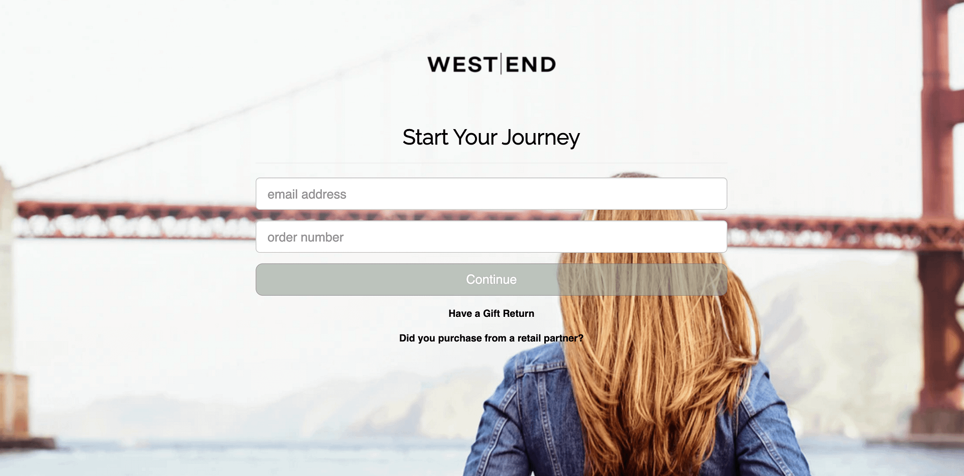
A return portal is a system that allows customers to start returns. Almost any return software includes a portal – whether it’s a more basic return app or a fully functional return solution like ReturnLogic.

The portal collects relevant information from the customer, confirms the purchase record, and enforces the retailer’s return policy. If shipping is specified, the return portal generates a shipping label.
To a customer, the return portal is where the return takes place. But as we know, there’s also the back-end operational side of returns. Here’s where powerful automation meets in-depth visibility.
How to Make a Better Return Portal
Ecommerce return rates typically fall between 10% and 20%, depending on the product category. Many of your customers go through your return portal, so make the experience count.
Placement of the Return Portal
The first step to a better return portal actually has nothing to do with the portal itself; it’s all about placement.
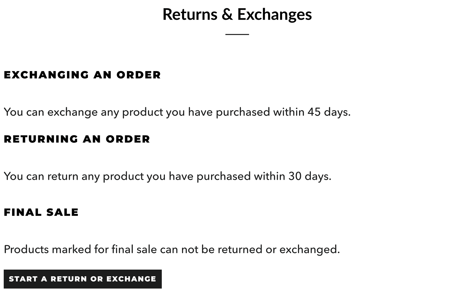
Your returns page should be easily accessible from the footer of your website. Try not to hide it in a sections like “Contact Us” or “FAQ.”

The goal is to minimize the number of clicks required to start a return. As many as 67% of shoppers visit a site’s return page before purchasing. So, if your return page is difficult to find, you might deter potential customers.
Branding the Return Experience
Next is the branding of the return portal, which spans from the return policy through to the portal itself.
Most people wouldn’t consider returns a branding opportunity, but they are if done correctly. If you want to see how customer-obsessed a brand is, check out their return process.

There shouldn’t be a stark contrast between your return portal and the rest of your website. The portal should blend in as a natural extension of the customer journey.
An Automated Return Portal
Last is automation within the return portal.
In its most basic form, a return portal is a questionnaire customers fill out when beginning a return. A more sophisticated return portal can enforce complex logic from your return policy.

No one likes to give the customer bad news. It’s a lot better for an automated portal to reject customers than for a customer service representative to do so.
An automated return portal will save time for your team and ensure a smoother experience for customers. For example, tasks that used to take 10 minutes for the Jofit team take less than a minute with their new automated portal.
Take Control of your Returns
No one likes returns – not retailers, and certainly not customers.
A branded portal for returns is the first step toward a more efficient and reliable return experience for your customers and your team.
With a great return portal, you’re on your way to smarter return management.


